How GoEnhance AI Helps Podcasters Bring Static Cover Art to Life
0m | Sep 27, 2026A podcast cover has a difficult job. It has to identify a show at a glance, often on a phone screen, while competing with dozens of other covers. When I plan a social post for a new episode, I usually want that same artwork to do one more job: introduce the episode in a short video without losing the look listeners already recognize.
GoEnhance AI is a browser-based platform for creating and editing AI images and videos. Its AI image to video generator gives me a way to start with existing artwork and describe the motion I want to explore. I treat the result as a separate promotional asset. The podcast cover displayed in listening apps can remain a still image.
Decide What Should Move
The most useful question comes before the prompt: which part of the cover tells the listener what this episode is about?
For an interview show, that might be a guest portrait. For a history podcast, it could be a photograph or illustration tied to the story. I would give that element a small amount of motion—a change in camera position, light moving across the background, or a detail coming into focus. The show title should still be easy to read when the video is paused.
This matters because cover art already has to work at a small size. Apple Podcasts’ show-cover guidance emphasizes legibility across different devices. I apply the same test to a motion version: I watch it on my phone at its ordinary feed size, rather than judging it only in a large editing window.
Make an Episode Announcement From the Cover
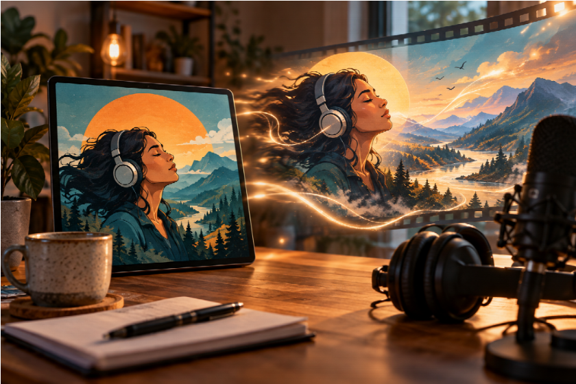
I would build a new-episode clip around one visual change and one piece of information. A slow move toward the guest’s face, for instance, can lead into the episode title and release date. There is no need to make the entire cover shift at once.
Text needs special attention. If a title is baked into the source image, generated motion may bend its letters or make them harder to read. My preferred approach is to work from a clean version of the artwork where possible, review the moving background, and add essential episode text afterward. That gives me control over what the viewer actually reads.
The video also needs a destination. A striking animation with no show name, episode context or listening cue may attract attention without helping anyone find the conversation. I keep the visual hook brief, then make the episode information unmistakable.
Try a Quieter Version for the Show Itself
An episode announcement can carry more energy than a general introduction to the podcast. When I need a clip that represents the show for longer than one release cycle, I would animate a picture with gentler motion: a slight push-in, a subtle background shift, or movement confined to one illustrated element.
The difference is editorial. An episode teaser can point to a particular guest or topic; an evergreen clip needs to communicate the show’s identity. I would avoid putting a release date into that second version, and I would check that the movement still suits older episodes as well as the newest one.
Fit the Clip Around the Audio
Pocket Casts has described how sharing podcast clips can help listeners pass along moments from a show in its post about clipping and sharing. A moving cover can support that kind of promotion, but I would let the audio remain the reason to listen. If I have a strong spoken moment, the artwork should frame it rather than distract from it.
I would watch the finished clip twice: once with sound and once muted. The silent viewing tells me whether the show and episode are identifiable in a feed. The version with sound tells me whether movement, captions and speech are working together. If they compete, I simplify the visual before adding anything else.
A podcast cover does not need an elaborate transformation to become useful in video. For me, the strongest result keeps the show recognizable, gives one element a reason to move, and makes the next step—listening to the episode—clear.